
Building 'Observability for the Rest of Us'
Contents
XO Ruby - Seattle
Well, XO Ruby - Seattle is a wrap! Being at a conference as a speaker is a special treat, and it’s been a while since I’ve stepped on a stage. A lot has changed since I last did public speaking. I really haven’t spoken since quite early in my career, when I talked a lot about functional programming and CoffeeScript, back when no one believed they’d use a compiler to write JavaScript. Ha! So if that doesn’t date me already, the process of authoring a slide deck has definitely changed.
I credit a lot of my original workflow to Test Double’s principal consultant Dave Mosher.

TL;DR
If you just want the parts list, here’s what the deck ended up being built from.
Typography
| Role | Typeface |
|---|---|
| Display / titles | IM Fell Double Pica SC |
| Body | Libre Baskerville |
| Section headers | Oswald |
| Annotations | Caveat |
Palette
| Role | Hex |
|---|---|
| Paper (ground) | #F2E8D5 |
| Ink (text) | #3D2B1F |
| Sepia rule | #8B6F47 |
| Tanager crimson | #C1272D |
| Tanager gold | #F5A623 |
| Olive (female register) | #6B7A3A |
Tools
| Job | Tool |
|---|---|
| Design board | Gemini |
| Slides | Open Slide |
| Illustration to SVG | quiver.ai |
| Copy, planning, font shortlist | Claude |
The rest of this post is how those choices got made.
HTML5 slides have always been a favorite
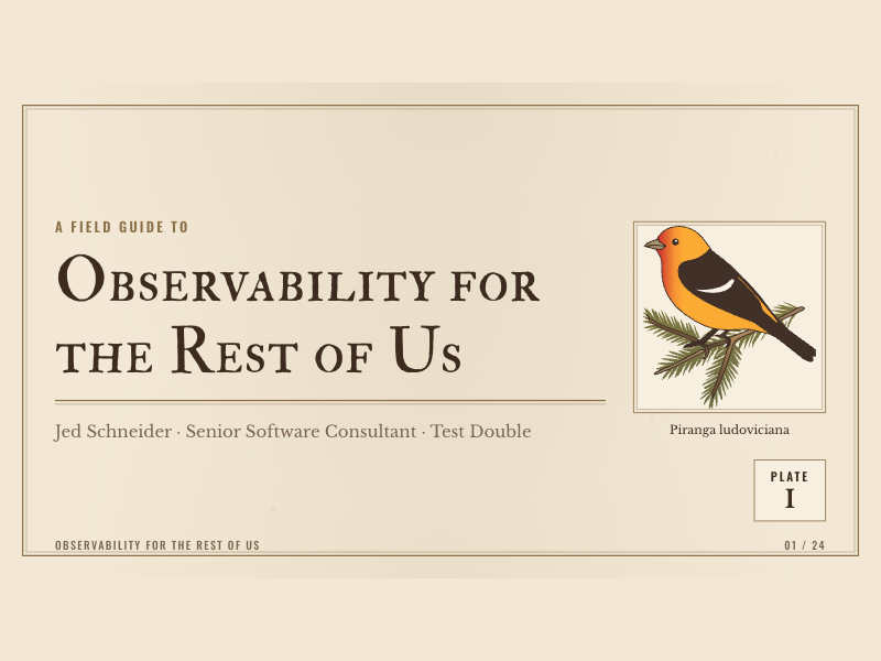
I’ve used reveal.js in the past, among other JavaScript slide-deck solutions, and I’ve always enjoyed the ‘can do’ feeling of building with the basic tools of the web. It just feels good to build things in a medium you know from start to finish, and to make something that doesn’t look like another keynote deck. But the challenge, of course, is that you only have so much time. The slides are important, but what you put on them and what you say matter equally. As a non-designer with taste but limited experience executing on it, making good design choices is a paralyzing task. So much so that many talks I’ve wanted to give never got off the ground.
How to build a slide deck in 2026
Like every tech gathering these days, the conversation at XO Ruby around AI was mixed, and I heard some genuinely interesting and polarized opinions on its use. I think it’s validating and grounding to hear from all sides. As it relates to slide decks, AI is taking an outsized role for me, to address the decision paralysis that usually keeps me from finishing. So, dear reader, if you read further, know there’s going to be a lot of AI tool use.
Gather your inspiration
Realize up front that this is going to be a lot of work, AI or not. For me that means gathering inspiration, both visual and narrative, that can carry me forward when things get tough. This is the center of the new flow for me: the sense that I can execute well enough to match the idea in my head is so much more confidence-inspiring than typing words into a Keynote slide.
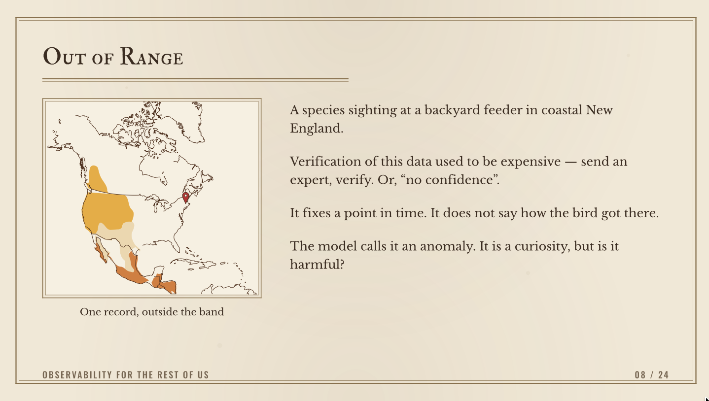
For this talk I knew, conceptually, that I wanted to use wildlife monitoring and telemetry collection as the central metaphor for tracing things like web requests through our applications. Earlier in the summer, a record number (for me) of Western Tanagers observed in the mountains of my childhood set the foundation for that inspiration. My mom had a bird guide, wrapped in a handmade leather binding (as you did in the 1970s), and, being drawn to maps as a way to explain the world, I knew I wanted an ‘out of range’ bird sighting as a key beat in the talk.
That ‘out of range’ sighting is the beat that eventually became this slide:
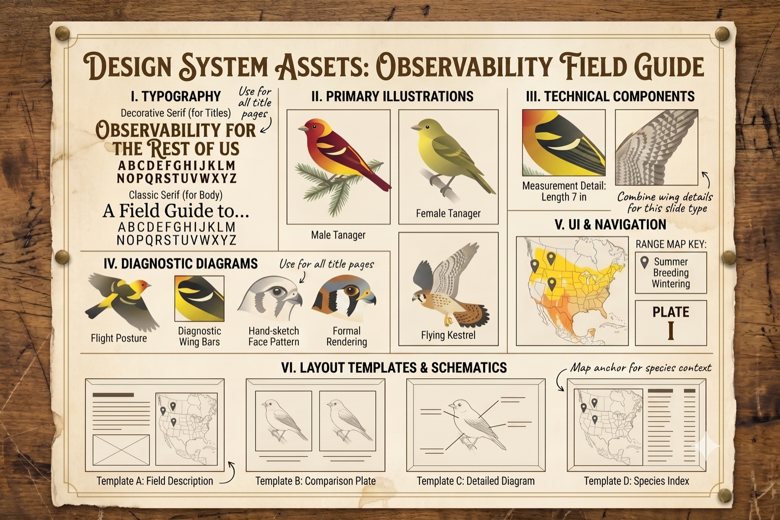
Equipped with these concepts, I set out to create a design system based on vintage field guides. Passed to Gemini, and after a few iterations and tweaks, I arrived at the design board for the deck.
Moving from design to slides
I’ve recently been using Open Slide to build decks. Its agent-first flow, where each slide is its own React component layered over good default design principles, is a nice trade-off between flexibility and utility.
For this project I started with an outline and a general set of ideas, then handed them to the compound-engineering brainstorming skill, which produced the plan. It boiled down to a handful of decisions.
The biggest one: extract the aesthetic into a theme before styling a single slide. Open Slide’s create-slide skill opens by asking you to pick a theme, and themes/ was empty. Because the whole field-guide look was already pinned down in the design board, lifting it into one field-guide.md theme let every page cohere without hand-styling each one. That theme captures:
- Palette: aged-paper ground
#F2E8D5, sepia rule#8B6F47, ink#3D2B1F, tanager crimson#C1272Dand gold#F5A623, plus an olive#6B7A3Afor the female-tanager register. - Typography: Berkshire Swash for display, Libre Baskerville for body, Oswald for letterspaced section headers, and Caveat for margin annotations only, never body.
- Fixed components: a
Titleblock, aPlatebadge (roman numeral, lower right), aFooter, anAnnotation(Caveat plus a curved arrow), and aSpecimenBox(thin double-rule frame with the caption below). - Layout templates: four, straight off the design board. Field Description, Comparison Plate, Detailed Diagram, and Species Index.
The plan also nailed the spine of the talk, the whole argument in one paragraph:
Lab science and field science are both legitimate. The lab constructs conditions so results are reproducible; the field observes conditions it cannot control. TDD is lab work, and it is excellent — an error report becomes a unit test that pins the bug forever. But the lab only ever covers bugs that announced themselves. A team whose only epistemology is the lab treats non-reproducible as non-existent, which is exactly what “cannot reproduce, closing” means and exactly what “have you tried turning it off and on again” means. Field practice — telemetry — is how you reason about the system you actually have rather than the one you modeled. And field science already solved this: the answer was open data, documented observations, and rapid response protocols, not dispatching an expert to verify each sighting.
If that framing interests you, it’s the seed of a related post: telemetry-driven development.
Once the theme existed, the metaphors dropped into the field-guide layout without much fuss. The ‘out of range’ sighting above became a range-map plate, the verification-cost argument sat right next to it, and I didn’t have to think about spacing or type again.
Plans are made to be changed
After the original plan was generated, I ended up tweaking the tone and content a lot. The typography is a good tell. The plan called for Berkshire Swash on titles, but that was only ever a starting guess. Rather than commit to it, I asked Claude to find faces of a similar character (decorative, period-appropriate, at home on a natural-history plate) and give me a shortlist to choose from. I narrowed that list, tried a few in the actual title component, retired some that looked right in a specimen but wrong at 140px, and eventually landed on IM Fell Double Pica SC, a small-caps face cut from seventeenth-century punches that carries the period feel without any synthesis. Letting the LLM do the searching and shortlisting, while I made the call, is a good chunk of why the deck got finished at all. In retrospect, I might have kicked things off with deeper personal writing and sidestepped some of the other rework.
After the first slide deck build I gave this talk in our Test Double weekly hangout, and the feedback provided by the team really changed the direction of the talk. I was able to critically assess a few of the main slides and visual concepts that had positive feedback, and build around those key elements.
Start with placeholders for images
One other strong decision I made was to defer the image creation with Gemini, until I knew which images I wanted and what would fit in the talk. So, I built the original deck with image placeholders, and I had Claude wrote a fairly comprehensive prompt guide that tracked along with the plan and slide deck. This gave me the minimum set of images I need to create and sequence to be built in an order that allowed me to have existing assets as inputs to the model as I went along.
Each prompt is two parts concatenated: a shared prefix — the style contract, identical for every image, which is what makes a dozen separately generated illustrations read as one book — followed by the subject for that specific plate.
The shared prefix:
Vintage natural-history field-guide plate illustration in flat vector style. Limited palette: sepia brown (#8B6F47), dark sepia ink (#3D2B1F), crimson (#C1272D), warm gold (#F5A623), olive green (#6B7A3A), on a plain warm cream background (#F7F0E1). Flat colour fills, at most one simple smooth blend per shape — no airbrush shading, no photographic rendering, no stippling. Crisp closed silhouettes and clean contour lines of even weight, in the manner of a nineteenth-century engraved plate. Plain flat background: no paper texture, no foxing, no speckle, no grain, no drop shadows, no vignette. No border and no frame. No text, no lettering, no labels, no numbers, no signature, no watermark.
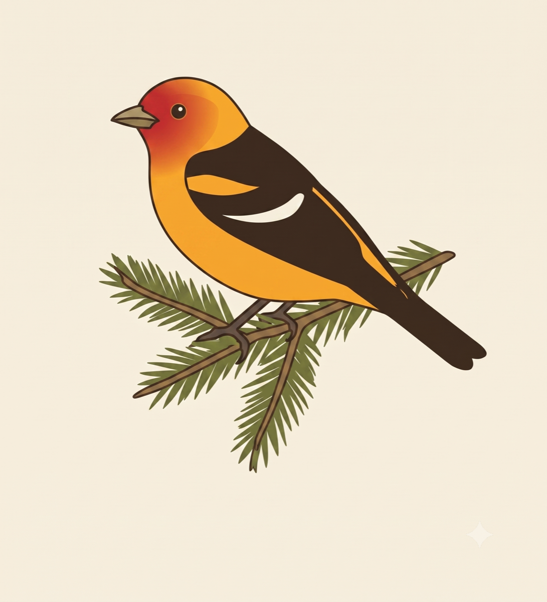
Then the subject. The male Western Tanager was the first plate, and the style anchor for everything after it — so rather than generate it from scratch, I fed the model the design board’s tanager crop and asked it to redraw and correct the plumage:
Redraw the attached bird illustration at high resolution in the same flat vector style, preserving its pose, its spruce sprig perch, and its line weight exactly. Correct the plumage to an accurate adult male Western Tanager (Piranga ludoviciana): bright red-orange head and throat; clear lemon-yellow nape, breast, belly and rump; black back, wings and tail; one yellow upper wing bar and one white lower wing bar, as shown in the attached wing-detail references. Widen the composition to 16:9, keeping the bird within the left two-thirds and leaving the right third as plain flat cream background for a measurement callout to be typeset later. No frame, no border, no caption, no text.
That plate then became the input attached to every prompt after it, keeping the same bird consistent across the deck.
This is the raster illustration output of that prompt.
What worked well
- The prompts to Gemini were effective. I got ‘more or less’ the elements I was looking for within a few iterations on the images.
- The model was good at reordering pages and responding to targeted prompts, like “change this on the selected slide” (Open Slide has a bidirectional agent connection, so the agent always knows what slide you’re looking at).
- React/JavaScript is well suited for annimation and while some of the slide animations could be improved with a dedicated easing library or similar, they were still quite effective at communicating intent.
The fun part was watching a technical idea pick up the whole aesthetic on its own. The migration-to-flame-graph concept, which I got positive early feedback on, is just the field-guide styling applied to a span waterfall:
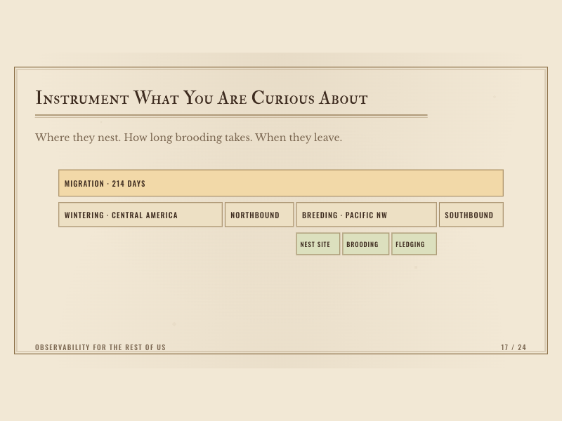
SVG generation
With the vector illustrations prepared, I used quiver.ai to actually create the SVGs. It has a tracing agent that fairly accurately traces an existing illustration and exports an SVG. The value of this approach is that an SVG is a much more flexible unit for scaling to a slide. If you change the layout later, it’s much easier to rescale a vector to match the new design than to wrangle a raster.
The traced SVG from the Gemini output above, ready to drop into a SpecimenBox at any size:
I did not get to animating the SVG’s, which was the other reason I thought they would be a great fit for the slide deck, but I got a chance to try that out ☝️ here.
The final 10% still took 90% of the time
So many good ideas, so little time to present them. It’s so easy for me to go deep and not look back. The constraints of the talk are what force me to make the hard decisions.
The agent flow gets you to something coherent pretty fast, but the last stretch is still manual. After the internal presentation of the talk, I again stripped it down to the key elements folks responded well to (the morph from the migration bar into a flame graph, which was the thing the early audience reacted to most). None of that is hard on its own. It’s just slow, and it only shows up when you sit down and click through the whole deck like you’re actually presenting it.
Cutting hurt the most. A whole thread on metrics, removing all discussion on storage, persistence, and patterns for creating low cost value all had to be cut. It introduced too many concepts too fast and muddied the through-line, so I cut it to keep the focus on data transport and discovery. The back third stayed the roughest right up to the day. It was the newest material and the least rehearsed, and there’s no tool that does the reps you haven’t done yet.
The part of the process I really like: I think my ideas changed on this subject, as I built it. More nuance, clarity, and depth than when I started. How cool is that?!